Huawei Enjoy 50 Pro begins HarmonyOS 3 beta testing
These 63 Huawei devices received HarmonyOS 3 so far [Details]
Huawei Enjoy 50 receives HarmonyOS 2.0.0.198
Huawei Mate 50 series gets December 2022 patch
Huawei rolling out a SuperHub feature patch
Refurbished Huawei Mate X2 Collector’s Edition open for sale
Huawei Enjoy 50z smartphone launched at 1199 yuan
Pre-order of Huawei Mate 50 and 50 Pro in Saudi Arabia starting on December 16th
Huawei Mate 50 Pro Carbon Black Vegan Leather launching soon [Updated]
Here are the top 5 Huawei Mate 50 features
Huawei P40 Lite grabs November 2022 update in Europe
5 year old Huawei mid-ranger gets new EMUI features
Huawei P30 Lite November 2022 update rolling out
Huawei Enjoy 50 receives HarmonyOS 2.0.0.198
Huawei Nova 7 5G gets November 2022 EMUI update
Get the latest My Huawei app [12.1.10.300]
December 2022 Google Play System update brings new changes to digital driver’s license
Google Play Store rules troubling Android users in US
Download Huawei Celia Keyboard [11.0.5.309]
Download Huawei HMS Core app (6.8.0.332)
Huawei is the only PC maker to make growth in Q3 2022 in China
Huawei MateBook 14 1TB version will launch on December 9
Huawei MatePad 11 gets new 8GB + 256GB storage version
Huawei MatePad SE tablets sold out in Indonesia
Huawei MateStation X 2022 specs leaked ahead of launch
Funny video shows Huawei Watch Buds carrying capsules inside
Huawei Children’s Watch 5X officially unveiled
New Watch GT 3 Pro Collector’s Edition is the best designed smartwatch
Huawei Watch Buds smartwatch with in-built earphones launched
[Update] Huawei Watch Buds is ready, check these pics before it launches
Published
on
By
The battery percentage is an essential feature and it’s available on almost all Android and even iOS devices. So today, we’ll take a deep look into the battery percentage icon comparison between Apple’s iOS 16, Google Android 13, Huawei EMUI 12 and HarmonyOS, Samsung One UI 5, Xiaomi MIUI 13, and OnePlus OxygenOS 13.
Battery icon:
A battery percentage is a number (numeric) that allows you to view the accurate battery level on your smartphone. Some phones don’t enable this feature by default.
Comparison:
For this comparison, we’ll look into the appearance, and how the percentage text appears around or inside the battery icon. Also, we’ll look into the additional options that each of these software offers to enhance the user experience.
iOS 16:
The notch on iPhone has forced Apple to oust battery percentage from its mobile software but iOS 16 has brought back this feature ono place. The battery icon is placed in landscape position including percentage text inside the battery icon. Both of these elements change colors into light and dark appearances based on the screen colors. It looks good. 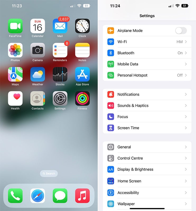
Android 13:
The stock Android 13 has its own way of showing the battery percentage label on the right side of the battery icon (vertical). Yeah, it looks good. However, there’s no option of showing the battery percent inside the icon. 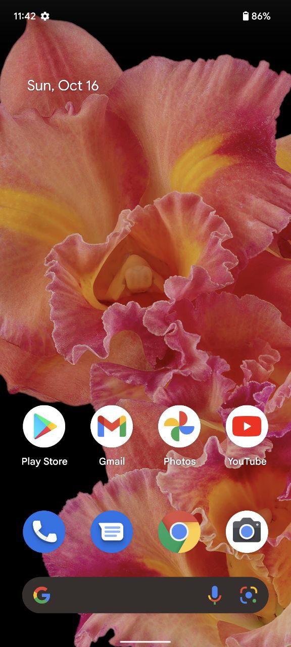
EMUI 12:
EMUI 12 and HarmonyOS share the same typography for battery labels but there’s a difference between them. EMUI 12 shows the percentage label on the left and HarmonyOS on the right. Also, this two software offer you to show battery-level text either inside the battery icon, on the side, or not at all. 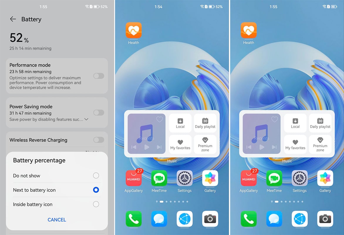
One UI 5:
Samsung also follows Android’s tradition because One UI also comes with a vertical battery icon but a battery percentage level on the left side. It is a decent look-through. 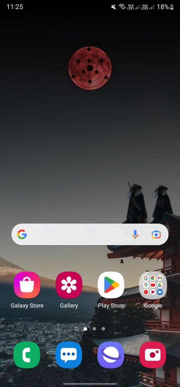
MIUI 13:
Xiaomi MIUI brings you both options to show percentages inside the icon (landscape) or on the right side. But one thing to mention is that its in-icon battery doesn’t clearly show the label. 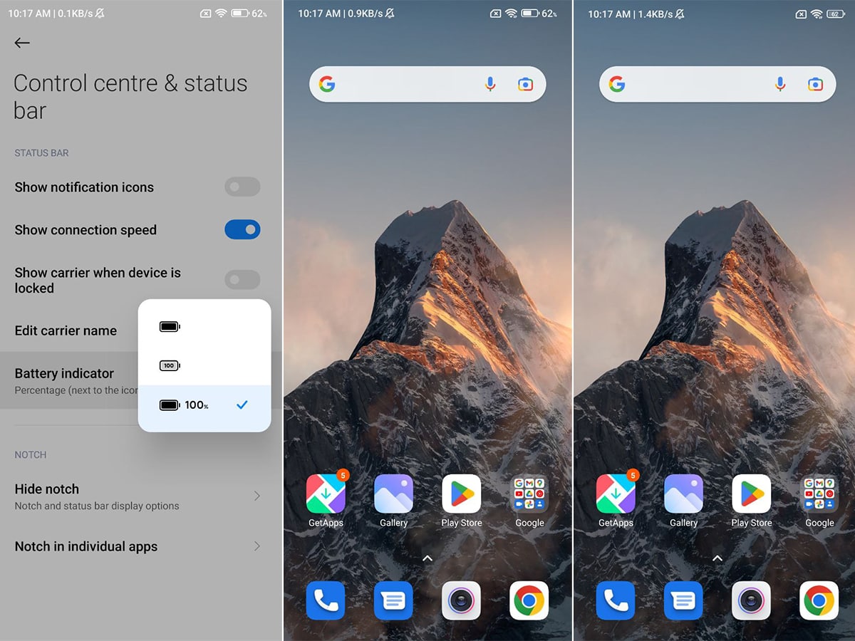
OxygenOS 13:
OxygenOS is quite interesting and comes with more options than any of the above-mentioned contenders to show improve the aesthetics of the battery percentage area.
There are two ways to customize the feature – one for the battery style and battery percentage.
Battery style has:
- Horizontal
- Vertical
- Loop
- Do not show
Percentage style:
- Inside battery icon
- Outside battery icon
- Do not show
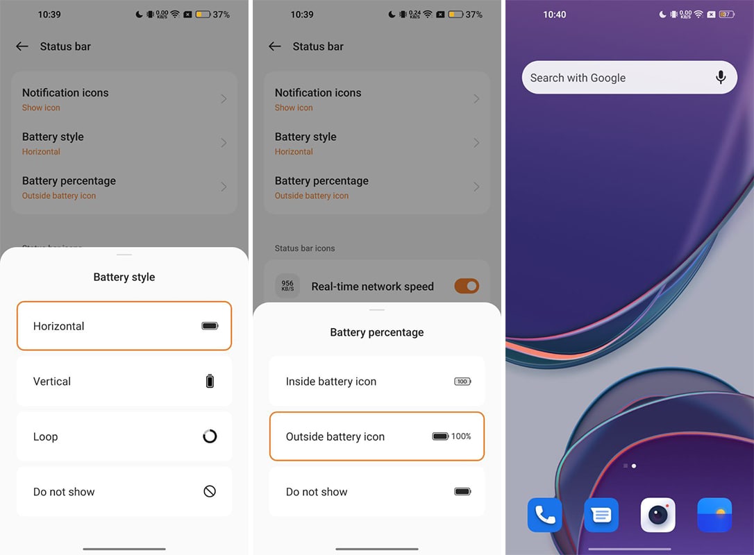
These options make it the most interactive provider of battery percentage settings. However, the appearance still lacks proper visibility for all of the available options.
Winner:
So, which is the winner? It’s iOS 16, followed by HarmonyOS. iOS uses a full-color fill to show the battery percentage inside the icon. Also, the battery icon is a big tall and maintained width as compared to other software. This allows Apple to increase the text size. If the battery level decreases, the battery icon doesn’t decrease the level, which keeps the percentage text visible.
HarmonyOS and EMUI 12 battery percentage visibility is quite good and deserves second place. However, one thing to note is that none of these have a better in-icon label than iOS 16. 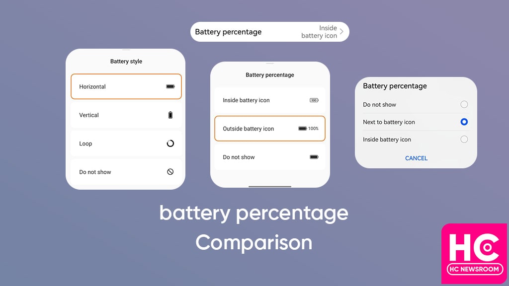
Which one is better, HarmonyOS 3.0 Super Device or EMUI 12 Device+?
iOS 15 vs iOS 16: What’s new in Control Center?
Amy is our firmware and software specialist, she keeps her eagle eyes open for new software rollouts, beta programs, and other software related activities as well as new smartphone launch.
Funny video shows Huawei Watch Buds carrying capsules inside
Huawei Mobile Services (HMS) posts record progress in 2022
Huawei P40 Lite grabs November 2022 update in Europe
Published
on
By
HarmonyOS 3 is a prime operating system and over the past two years, the Chinese tech maker has proved that it’s thinking par Android 13 to bring a new user experience, a example of this theory is the new navigation bar.
Yes, HarmonyOS 3 brings a new navigation bar that’s wider and better than Android 13. That’s how we’re bringing you this comparison between both of these mobile operating systems and checking what HarmonyOS 3 has to in the navigation bar offers over Android 13.
Android 13:
Although, Android 12 already had a navigation bar indicator but Android 13 enhances the appearance and makes it wide.
Talking about the interactions, the navigation bar on Android 13 sits on the very bottom of the screen but it doesn’t respond to gestures and remains static.
It is there all of the time, whether you are on the home screen, lock screen, quick settings, or in the application. However, it does go out while playing a full-screen app or video. Aside from these aesthetics, Android 13 gestures are good and react fast. 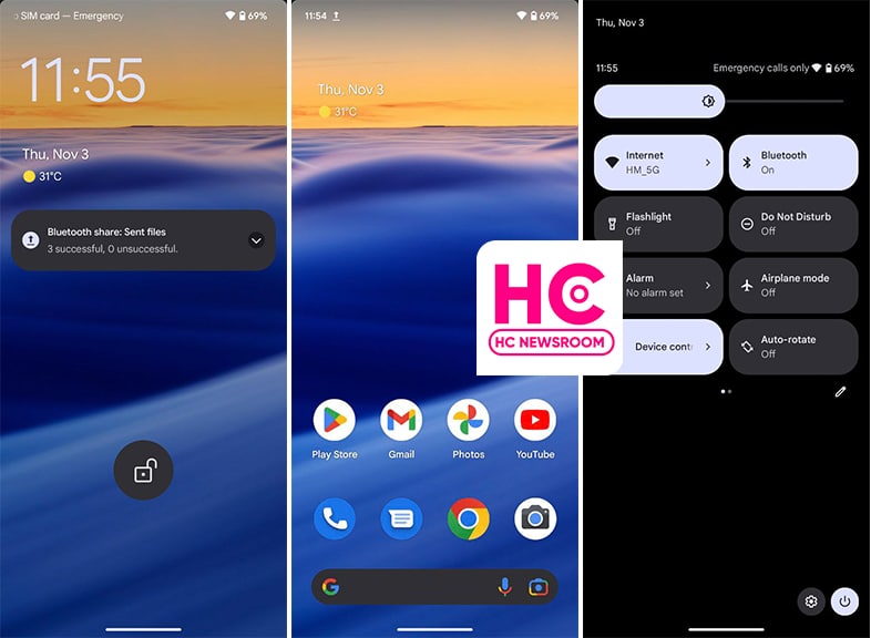
HarmonyOS 3:
This new HarmonyOS version comes with a wide navigation bar indicator that is wider than Android 13. The indicator wasn’t available in the past version and making its debut.
The interesting part of the story lies in the fact that it is interactive from the core. For example, if you swipe up, the indicator will animate with the motion of your swipe gesture. 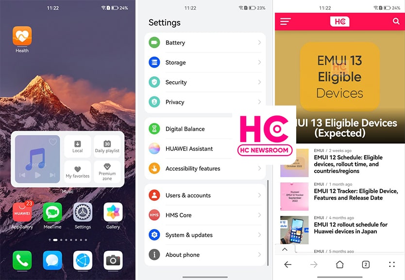
More on this, the navigation bar indicator on HarmonyOS 3 hides on the lock screen, control panel, and home screen to showcase the full screen. Meanwhile, it only appears when you open or navigates to Settings or apps. However, there should have been a navigation gesture sensitivity controller, which is available already on Android devices.
Yeah, Huawei HarmonyOS is improving the user experience and trying to match the standard that mobile user loves to surf. On the side, Android is only trying to evolve with low-key innovations.
Published
on
By
Huawei has always nurtured its users with amazingly good connectivity features. One is the HarmonyOS 3.0 Super Device feature, while the other is EMUI 12 Device+. Today we will discuss, how these features are different from each other, and which one serves best for you.
Interconnection is a demanding service, every user requires a smooth, secure and reliable connection between their devices. As we are moving ahead with technologies, connectivity has started to lacking behind.
Interaction problems among devices have become a common but major issue. But thanks to Huawei, it has taken care of both Chinese as well as global users in this aspect. The company has sheltered its devices with Super Device and Device+ features and managed to offer efficient interconnection services.
So let’s begin our exploration with Super Device and Device+
HarmonyOS 3.0 Super Device
Launched with HarmonyOS 2.0, Super Device is a prominent feature that drives all HarmonyOS gadgets effectively. It allows you to connect and operate other smart devices just by using the smartphone. For instance, with one tap, users can control and manage smart homes, smart vehicles, and other eligible gadgets.
With the latest HarmonyOS version, Huawei has enhanced this feature to more extent. Consequently, various devices can be flexibly combined, interconnected, and coordinate with different Huawei IDs. This gives you instant results in smooth and efficient interactions between your devices. 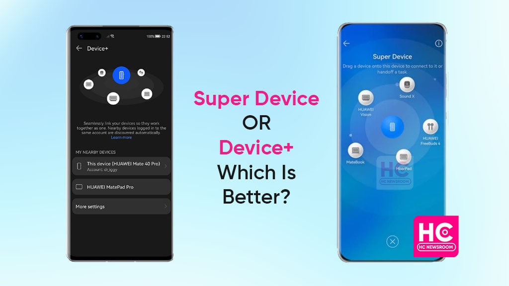
As mentioned, Huawei introduced this feature with HarmonyOS 2.0. At that time, global users were also expecting to taste this feature on their devices. However, the company soon made it clear that HarmonyOS phone-oriented features will remain exclusive in China.
Though users have the chance to enjoy HarmonyOS eye-catching elements on other devices. Such as tablets, smartwatches, speakers, smart screens, and more. Yet, phone features are still in anticipation.
EMUI 12 Device+
To benefit global users with efficient interconnection, Huawei unveiled EMUI 12 with the Device+ feature. Just like Super Device, the respective feature allows you to collaborate with numerous devices.
It makes your tablet or smartphone a hub for nearby Huawei gadgets. As a result, you can easily manage your every handset with a single device. Despite Huawei has tried to provide all its users with equal benefits, here are some dissimilarities that will hype your urge for HarmonyOS 3.0 system.
Dissimilarities between Super Device and Device+
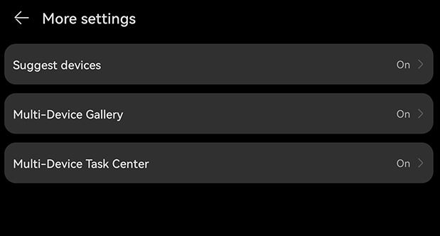
1. Multi-Device Task Center
Although both features exhibit some fascinating services for consumers. Yet, only Super Device features can operate several tasks between your different devices. In Super Device settings, users can enable a Multi-Device Task Center that allows switching tasks between devices logged into the same Huawei ID.
2. Nearby Devices Map
Yes, you will find a map of nearby devices when enabling the Super Device feature in contrast to Device+. It allows you to connect with supported devices on the map with just a drag-and-drop gesture. 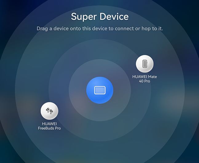
Apart from these features, the rest of the things are similar. To summarize, we can say that Super Device and Device+ both play a significant role in providing an immersive user experience. However, I think Huawei has paid a little more attention to HarmonyOS 3.0 with some additional features than EMUI 12.
Meanwhile, EMUI still has equal part of Android inside rather than being a HarmonyOS based software.
Published
on
By
Apple has released iOS 16 for iPhones and users are installing this new software to get the latest features. We’ll compare iOS 16 with the iOS 15 control center and inspect its different perspectives and what’s new in these prime iOS versions.
What is Control Panel:
Control Center allows you to enable or disable various instant features without requiring you to open them entirely on the Settings menu. This feature is similar to quick settings in Android phones.
iOS 15:
iOS 15 Control center allows you to access the control center with a swipe downwards from the top right corner of the screen.
From there you can manage connectivity such as BlueTooth, WiFi, Airplane mode, and more. On the other hand, you can control playback, as well as brightness and sound sliders.
Furthermore, you can edit these switches from the Settings and add more shortcuts. 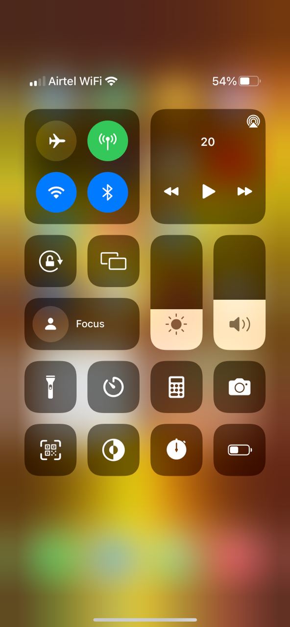
iOS 16:
iOS 16 brings you the same Control Center as iOS 16 and there are no major changes found in appearance. Meanwhile, the options remain the same as well. 
Copyright © 2022 Huaweicentral.com