Huawei Mate 20 series gets HarmonyOS 3 beta with new features
HarmonyOS 3 Upgrade Schedule: Devices and Timeline
Open source HarmonyOS adds support for ZT925 payment device
Huawei Pocket S grabs December 2022 update
These 4 Huawei Nova models joins public HarmonyOS 3 public beta
Huawei will launch two flagship phones in 2023: Supply Chain
WIKO 5G Huawei Nova 9 SE live image leaked
Huawei Mate 50 RS opens sales on JD
4G is still the way for Huawei next year
Huawei phones will still use Qualcomm chip in 2023
Huawei Nova 9 improves security with December 2022 EMUI update
Huawei FreeBuds 5i gets system stability update
Huawei Mate 20 series gets HarmonyOS 3 beta with new features
December 2022 EMUI update out for Huawei Nova 7 5G
Huawei Pocket S grabs December 2022 update
Download Huawei AppGallery App (12.7.1.300)
Google Play Store 33.6.13 is up in stock
Get the latest My Huawei app [12.1.10.300]
December 2022 Google Play System update brings new changes to digital driver’s license
Google Play Store rules troubling Android users in US
Huawei MateBook D14 SE notebook gets 16GB RAM version
Huawei MatePad SE and Pro 12.6 gets new memory version to Malaysia
Huawei MatePad Pro 10.8 gets November 2022 patch
Huawei is the only PC maker to make growth in Q3 2022 in China
Huawei MateBook 14 1TB version will launch on December 9
Huawei Band 4 with SpO2 opens sale at lowest price
Huawei launches ‘Year of the Rabbit’ FreeBuds earphones engraving service
120 inch virtual screen Huawei Vision Glass goes on sale
Huawei FreeBuds 5i gets system stability update
How’s your Huawei Watch GT 2 smartwatch doing in 2022?
Published
on
By
Samsung One UI 5 is the latest mobile software based on Android 13 but the software is making slow progress for a better user experience as compared to Huawei EMUI 12.
One UI 5 is one of the most low-approved software and it lacks innovation as well as smoothness. Don’t take my word for it, if you have a Samsung phone, you may like it ‘a bit’ but if you have a Huawei phone or even an iPhone then, you may want Samsung to kick in some new efforts.
Currently, Samsung is busy sending One UI 5 software to old devices. As compared to One UI 4.1, Samsung has made some changes in the user interface and a few in the features section. However, these changes are teeny tiny on the surface.
For instance, Samsung One UI 5 quick settings are similar to One UI 4.1. There is a small change that is powered by Android 13’s Material You design and the rest of the UI and functionality remain the same.
To access One UI 5 quick settings, you can swipe down from the top and swipe again to open the full panel. On the top tray, you will get key features of search, power, and settings, as well as edit.
Followed by a large space for time and date and followed by device control and media output manager. The bottom section includes SIM manager options, quick access icons, and a brightness slider. These are the same old features that were available in One UI 4.1. 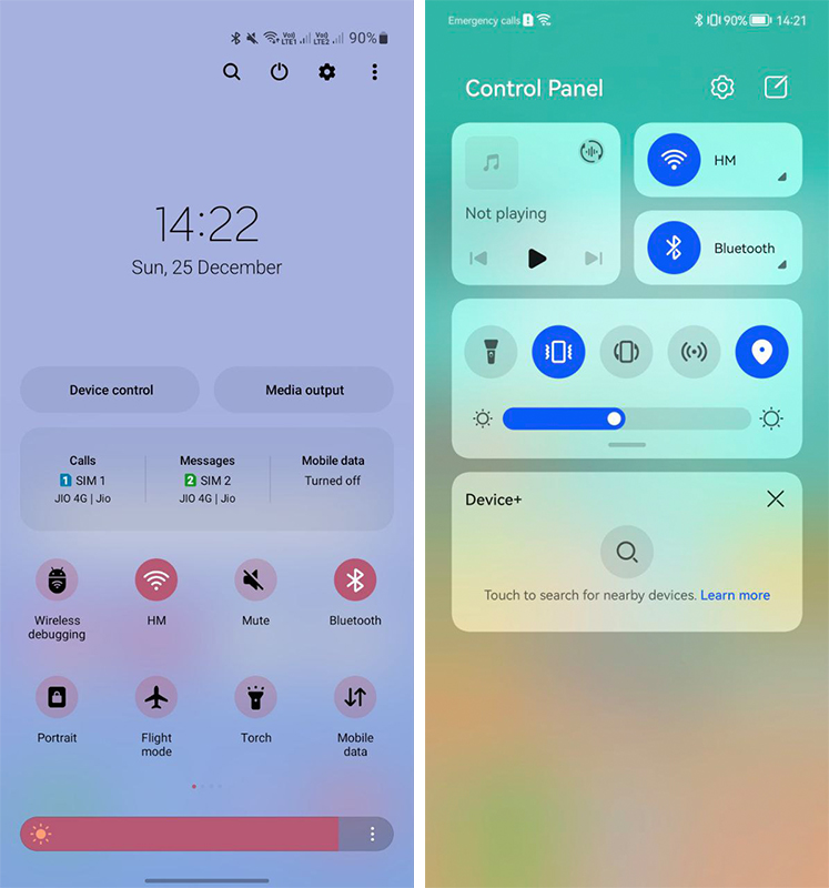
On the other hand, EMUI 12 renovated the user experience for Huawei smartphone users. The Control Panel (quick settings) combines a number of new features and services that weren’t there before.
The control panel brings simplicity at hand. Starting from the top section, the phone could use it to control WiFi, Bluetooth connected device way better than One UI 5. There’s a media controller that will allow you to manage playback
Do you think that’s the end of the story? Nope, because Huawei EMUI 12 quick settings enable audio projection to broadcast music on different devices all at once.
The EMUI 12 control panel has quick settings icon section, which has big dials than Samsung One UI 5. Talking about creativity, EMUI 12 further outshines One UI 5 with its Super Device and Smart Device controllers.
Samsung is free to brag about smartphone sales in the global market but when it comes to features and user experience, One UI 5 is still far away.
What do you think, Samsung One UI 5 has better quick settings or EMUI 12? Let us know via the tweet below.
Samsung One UI 5 Quick Settings (COMMENT) vs Huawei EMUI 12 Control Panel (LIKE) pic.twitter.com/qhtPI43U67
— HC Newsroom (@HCNewsroom) December 25, 2022
Samsung One UI 5 Quick Settings (COMMENT) vs Huawei EMUI 12 Control Panel (LIKE) pic.twitter.com/qhtPI43U67
— HC Newsroom (@HCNewsroom) December 25, 2022
HarmonyOS 3 vs Android 13: Users interface and key features
I like to listen to music, sing, dance, and play outdoor games. I have a huge interest in reading novels and cooking. I’m good enough as a speaker. Besides, I have the willingness to learn new things and increase my knowledge in different aspects with full dedication and determination.
Huawei launches new FusionSolar website
Huawei patent new feature for cross device camera shooting
Huawei Band 4 with SpO2 opens sale at lowest price
Published
on
By
Huawei HarmonyOS 3 is loaded with lots of features and Android 13 is also in line with the latest offerings. These two prime software are designed for a better user experience and rolling out for various smartphones.
Both HarmonyOS 3 and Android 13 software have their own set of weapons. And in this article, we’ll compare some of the newest features of these two mobile operating systems.
Note: The Android 13 is a stock version.
Home screen and layout:
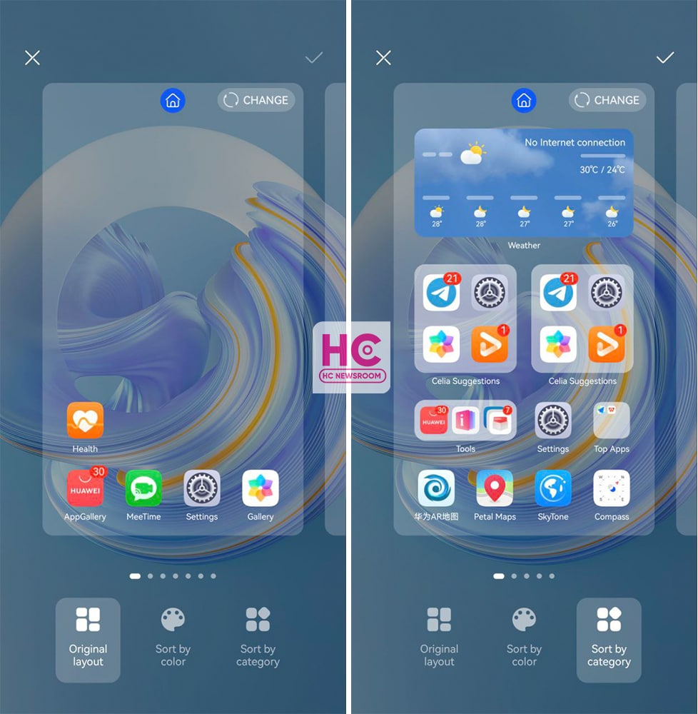
HarmonyOS 3 brings a new auto-layout feature that allows you to restructure the home screen content based on the original layout. Or you can sort by color or just by category.
However, Android 13 has no feature to manage the screen layout. This is quite disappointing. 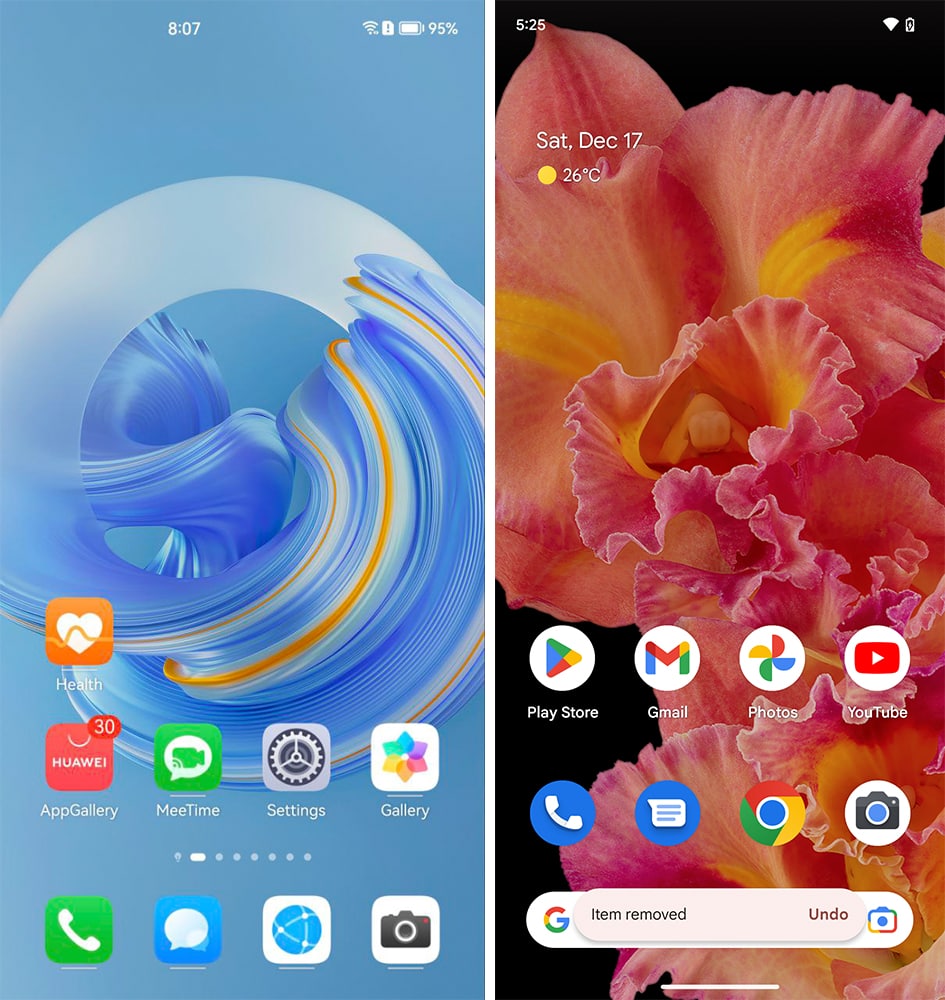
App snippets:
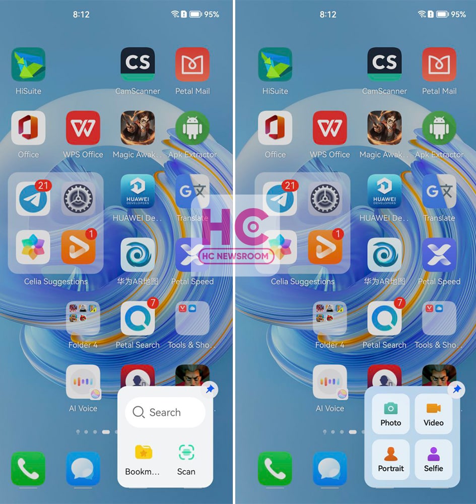
One of the most innovative features of HarmonyOS 3 is its App Snippet. The feature allows you to open key features of an application without opening the app first. Once again, Android 13 don’t give such access to the feature.
Large folders:
Huawei introduced large folders with HarmonyOS 2 and HarmonyOS 3 gets you a new range of layouts. Large folders is a real innovation and several Chinese phone makers have copied this feature from Huawei.
However, stock Android 13 lacks it but the software does follow the traditional app folder instead. 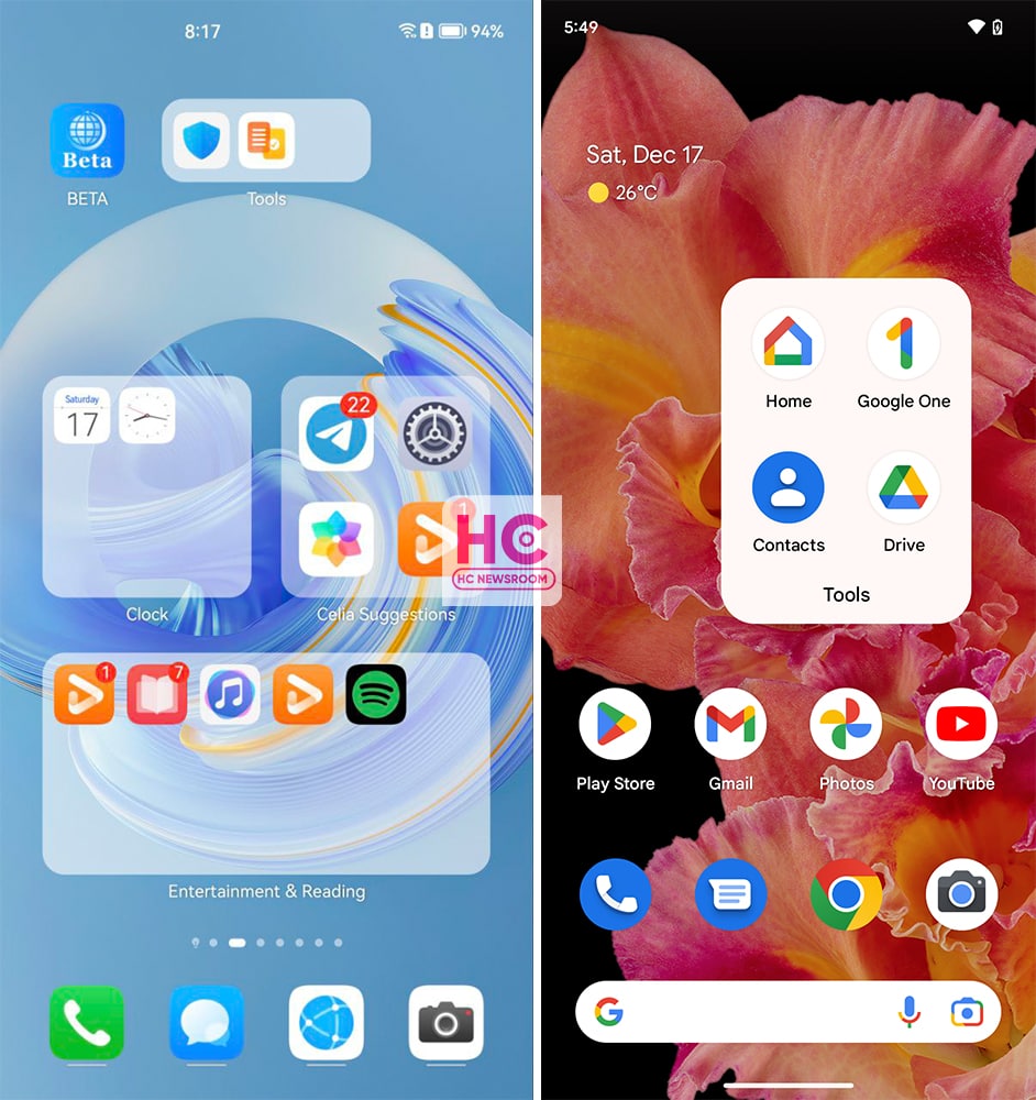
Service widgets – stacked, grouped:
Service widgets enable you to preview app info and access app features. However, HarmonyOS 3 gets you additional gifts such as group and stack widgets. Android 13 also lets you add app and service widgets but it doesn’t offer you the same level of compatibility as HarmonyOS 3.
However, you can resize the widgets similar to large folders by stretching anchors, which looks pretty neat. 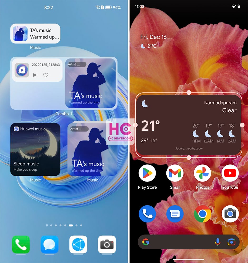
Control Panel and Quick Settings:
HarmonyOS 3 has one of the best quick settings on all smartphones. This has various services such as Audio Control Panel, Shortcuts, Super Device, Smart scenario manager, and smart device control. With HarmonyOS 2, Huawei introduced a separate space for notifications but the company improved the control panel and notification center with this upgrade.
Similar to Android 12, stock Android 13 follows the tile-powered quick settings. These are pretty big tiles (easy to tap) with a brightness controller, edit button, and shortcut for the Settings menu. However, I recognize that the virtual power button on Android devices is missing on HarmonyOS. 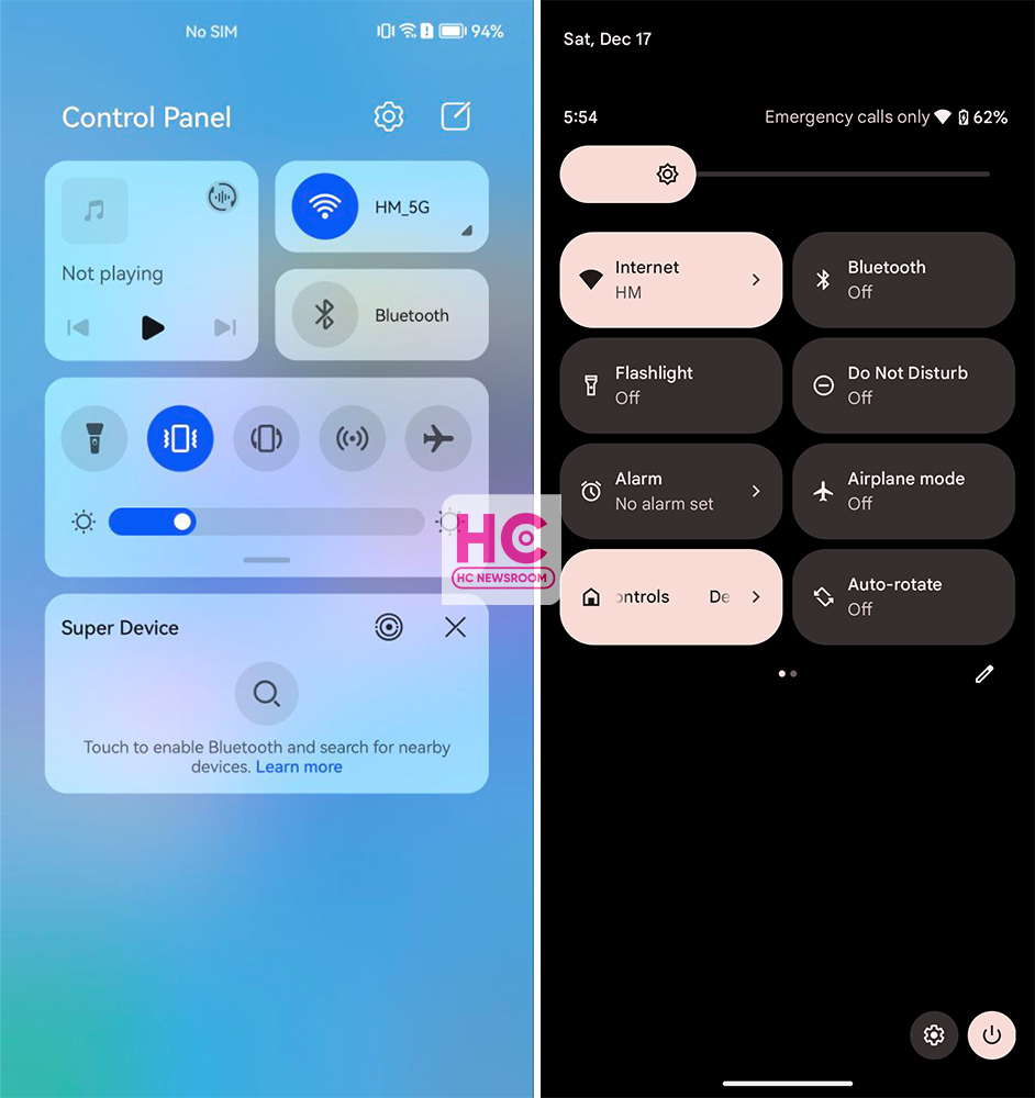
Settings:
HarmonyOS 3 has a colorful combination of icons and text and the background card container enhances the overall view. On the other hand, Android 13 has its own specialty provided by Material You and it makes the entire user interface interesting. 
Security and Privacy:
These are two enhanced functionalities on both of these operating systems. HarmonyOS 3 and Android 13 offer privacy and security center features. These allow you to recheck the security measures and app permissions anytime. 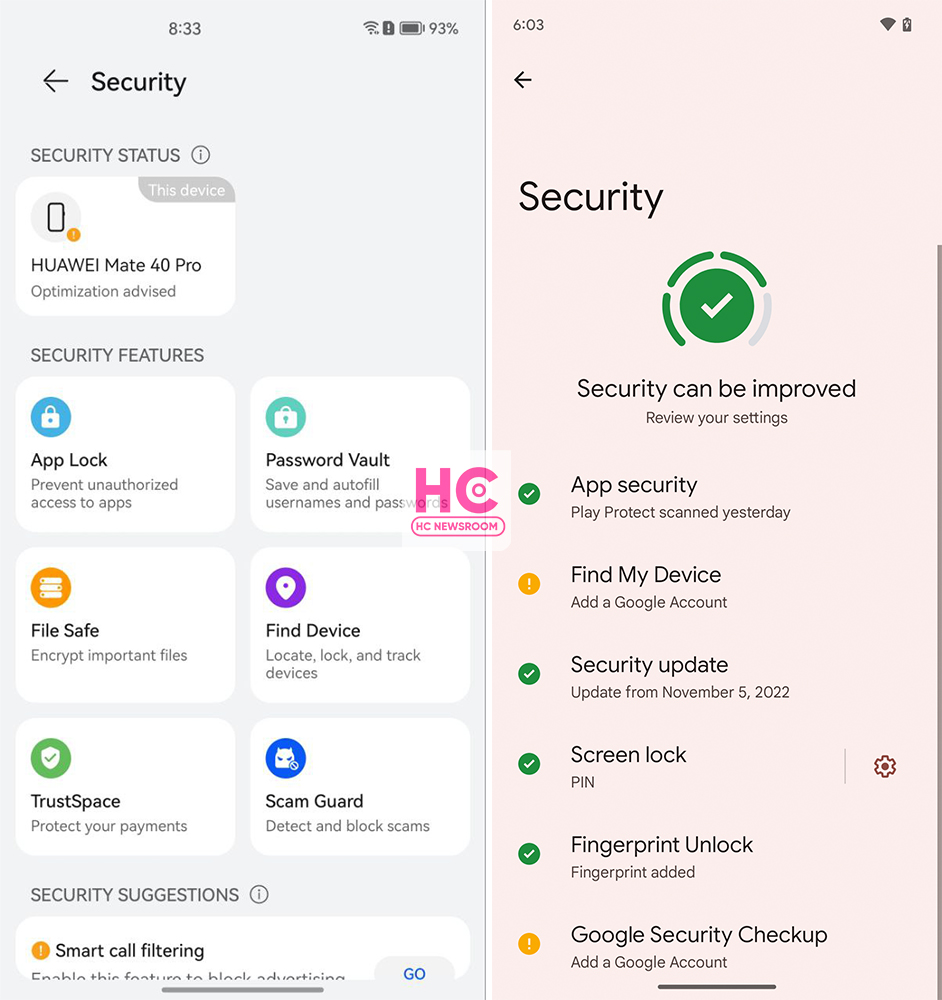
So, there we have it, our brief comparison of Android 13 and HarmonyOS 3.
Published
on
By
HarmonyOS 3 is a prime operating system and over the past two years, the Chinese tech maker has proved that it’s thinking par Android 13 to bring a new user experience, a example of this theory is the new navigation bar.
Yes, HarmonyOS 3 brings a new navigation bar that’s wider and better than Android 13. That’s how we’re bringing you this comparison between both of these mobile operating systems and checking what HarmonyOS 3 has to in the navigation bar offers over Android 13.
Android 13:
Although, Android 12 already had a navigation bar indicator but Android 13 enhances the appearance and makes it wide.
Talking about the interactions, the navigation bar on Android 13 sits on the very bottom of the screen but it doesn’t respond to gestures and remains static.
It is there all of the time, whether you are on the home screen, lock screen, quick settings, or in the application. However, it does go out while playing a full-screen app or video. Aside from these aesthetics, Android 13 gestures are good and react fast. 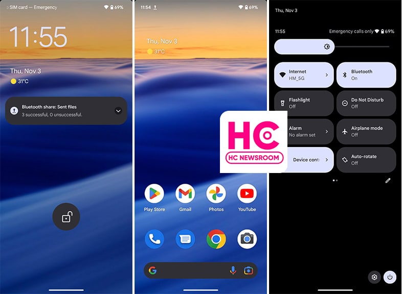
HarmonyOS 3:
This new HarmonyOS version comes with a wide navigation bar indicator that is wider than Android 13. The indicator wasn’t available in the past version and making its debut.
The interesting part of the story lies in the fact that it is interactive from the core. For example, if you swipe up, the indicator will animate with the motion of your swipe gesture. 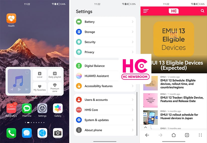
More on this, the navigation bar indicator on HarmonyOS 3 hides on the lock screen, control panel, and home screen to showcase the full screen. Meanwhile, it only appears when you open or navigates to Settings or apps. However, there should have been a navigation gesture sensitivity controller, which is available already on Android devices.
Yeah, Huawei HarmonyOS is improving the user experience and trying to match the standard that mobile user loves to surf. On the side, Android is only trying to evolve with low-key innovations.
Published
on
By
Huawei has always nurtured its users with amazingly good connectivity features. One is the HarmonyOS 3.0 Super Device feature, while the other is EMUI 12 Device+. Today we will discuss, how these features are different from each other, and which one serves best for you.
Interconnection is a demanding service, every user requires a smooth, secure and reliable connection between their devices. As we are moving ahead with technologies, connectivity has started to lacking behind.
Interaction problems among devices have become a common but major issue. But thanks to Huawei, it has taken care of both Chinese as well as global users in this aspect. The company has sheltered its devices with Super Device and Device+ features and managed to offer efficient interconnection services.
So let’s begin our exploration with Super Device and Device+
HarmonyOS 3.0 Super Device
Launched with HarmonyOS 2.0, Super Device is a prominent feature that drives all HarmonyOS gadgets effectively. It allows you to connect and operate other smart devices just by using the smartphone. For instance, with one tap, users can control and manage smart homes, smart vehicles, and other eligible gadgets.
With the latest HarmonyOS version, Huawei has enhanced this feature to more extent. Consequently, various devices can be flexibly combined, interconnected, and coordinate with different Huawei IDs. This gives you instant results in smooth and efficient interactions between your devices. 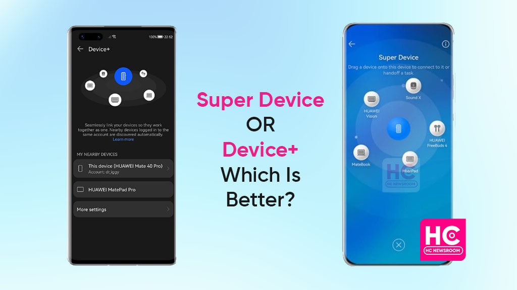
As mentioned, Huawei introduced this feature with HarmonyOS 2.0. At that time, global users were also expecting to taste this feature on their devices. However, the company soon made it clear that HarmonyOS phone-oriented features will remain exclusive in China.
Though users have the chance to enjoy HarmonyOS eye-catching elements on other devices. Such as tablets, smartwatches, speakers, smart screens, and more. Yet, phone features are still in anticipation.
EMUI 12 Device+
To benefit global users with efficient interconnection, Huawei unveiled EMUI 12 with the Device+ feature. Just like Super Device, the respective feature allows you to collaborate with numerous devices.
It makes your tablet or smartphone a hub for nearby Huawei gadgets. As a result, you can easily manage your every handset with a single device. Despite Huawei has tried to provide all its users with equal benefits, here are some dissimilarities that will hype your urge for HarmonyOS 3.0 system.
Dissimilarities between Super Device and Device+
1. Multi-Device Task Center
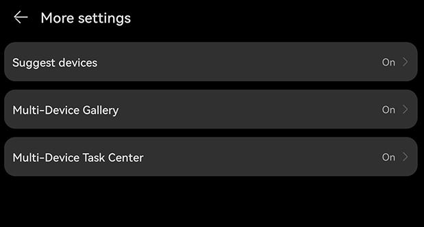
Although both features exhibit some fascinating services for consumers. Yet, only Super Device features can operate several tasks between your different devices. In Super Device settings, users can enable a Multi-Device Task Center that allows switching tasks between devices logged into the same Huawei ID.
2. Nearby Devices Map
Yes, you will find a map of nearby devices when enabling the Super Device feature in contrast to Device+. It allows you to connect with supported devices on the map with just a drag-and-drop gesture. 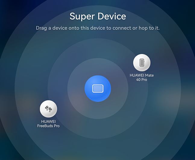
Apart from these features, the rest of the things are similar. To summarize, we can say that Super Device and Device+ both play a significant role in providing an immersive user experience. However, I think Huawei has paid a little more attention to HarmonyOS 3.0 with some additional features than EMUI 12.
Meanwhile, EMUI still has equal part of Android inside rather than being a HarmonyOS based software.
Copyright © 2022 Huaweicentral.com